Overview
Problem
Quest customers have a hard time finding the right product licensing and savings suites for their needs. They find the content on the e-commerce website confusing. A single mistake during the purchase can lead to calls to sales and affect missing savings they could make during their online shopping.
Solution
We redesigned the website to guide choosing the right product that fits the expectations of our customers so that they can benefit from promotions during the purchase journey without having to call sales and avoid extra work for the return process. Here are some of our high-level goals:
- Organize content for deeper engagement
- Align branding to create a consistent experience
- Make the checkout easy and fast for everyone, on any device, anywhere
My Role
UX/UI Designer
Timeline
4 Months (2018)
Team Members
Designer, Stakeholders, Product Manager, Project Manager, 3rd-party Developers, Sales Team
Tools
Sketch, Frontify, InVision, Zeplin
Our Approach
1 Research
- Initial Exploration
- Survey
- User Interviews
- Literature Review
- Task Analysis
2 Design
- Ideation
- Wireframes
- User Feedback & Revisions
- Mockups
3 Evaluate
- Usability Testing & Design Iteration
- Final Prototype & Mobile Mockups
- Hand Over to Developers
- Impact & Improvements
My Contribution
During the research phase, I worked closely with our data scientist to capture issues based on existing data in Google analytics. I contributed to stakeholders and user interviews. Plus, I did a literature review to understand e-commerce best practices and created a task analysis based on research results.
I created low-fidelity wireframes based on our findings in the research phase and moderated user feedback and brainstorming sessions. I then designed the user interface for the entire website using Sketch and created a prototype using InVision.
During the development phase, I was in charge of handing over UI specifications to our third-party vendor using Zeplin. I also contributed to UI testing and provided feedback to developers.
During the evaluation phase, I moderated usability testing sessions and was in charge of analyzing the data and deriving design recommendations accordingly.
Research
Initial Exploration
I started my journey by using the platform with fresh eyes to have a deeper understanding of the current flow and potential areas of improvement.


Following are some of my initial findings:
- The listing page had an overwhelming amount of information for each product which adds to cognitive load.
- Quantity of the products could only be adjusted at the cart level and not the product level which is not standard in other e-commerce sites.
- Cart and checkout were both on a single page which made the purchase process seem unnecessarily long.
- Unless I open different editions of a specific product in a new tab, I didn’t have a way to easily compare them side by side. It required a high cognitive load to focus and identify the differences.
- In the future, it would be nice to have a single sign-in for both marketing and e-commerce domains to build a dashboard and create a more personalized experience for our customers.
Survey
Initially, I started by looking at iPerception survey results that we conducted last year at the end of the shopping journey. My goal was to capture both negative and positive feedback from customers to start brainstorming ideas for improvements.
Survey Questions
- What was the primary purpose of your visit?
- What role do you have?
- Did you accomplish your desired task?
- How would you like products organized?
- What other information you would like to see about the products?
- Did you need assistance to make a purchase decision?
- Is there anything that you want to mention to improve the experience?
- How would you rate your overall experience?
Survey Answers
- Hard to find a product on the listing page
- Prices are confusing for international visitors
- Overwhelming product details
- Hard to find the right edition based on needs
- Couldn’t find contact sales


Main findings in the survey include:
- Some visitors land on Quest e-commerce website for browsing and comparing product prices with competitors, others have already done their research and are ready to buy
- Users can benefit from additional savings when they call sales representatives
- Pricing units are inaccurate for international visitors
- Product information needs to be laid out using clean and usable patterns
- Product information is overwhelming on the listing page causing discoverability issues
- It is hard to compare different editions of a product to make a purchase decision
User Interviews
To better understand our customers and their issues, I took the lead to conduct several semi-structured phone interviews with the sales team to collect direct input from our customers. Following are some of the main findings (highlighted items are overlapping with survey result) :
- Purchase conditions are buried in the product detail section with other information
- Existing customers may benefit from additional savings but wouldn't know unless they call sales
- Different saving options are obscure while choosing a support plan for certain products
- The checkout process is long and requires too much back and forth
- It is hard to compare product features
I couldn’t tell the difference between RemoteScan enterprise and RemoteScan enterprise user edition, I had to call sales to get a better understanding of the features to make a decision.
Besides, we had a few phone interview sessions with different business unit stakeholders. Our primary goal was to understand the business needs and how we could leverage them with our customer needs and kill two birds with one stone. Here are some of the concerns and needs we identified:
- The high volume of support calls due to lack of properly formatted information on the site which was quite costly
- There is a need for a space to promote featured products & new releases
- Lack of context for the customers visiting from external sources
Metrics show over 50% of customers purchasing RemoteScan on shop enter from a generic RemoteScan buy page that does not provide any product content or comparison. We need a solution for this within the shop to insure a clean and informative customer journey to purchase.
Literature Review
I looked into studies that focus on all aspects of designing a smooth checkout user experience from Baymard Institute. This would help me learn from industry mistakes and apply best practices to my design.
Quantity dropdown functionality
Auto-update quantity dropdown as soon as it changes and allow “quantity 0” as a way to delete products
Form fields
Optimize the number of form fields to avoid checkout abandonment
Auto-fill
Minimize the amount of typing by auto-filling form fields & eliminate typos
Checkout flow
One page with accordions along with accordion steps collapsing to summaries can help ease of review and edit of order information in checkout
Payment security
Gain trust by visually satisfying customers security perception of a secure payment
Task Analysis
Based on the data we collected we created a task analysis for each customer journey to better understand user pain points when shopping through several channels.
Primary Flow

Secondary Flow

Tertiary Flow

Design
Ideation
As a team, we conducted a design-studio workshop to come up with as many ideas as we can to solve existing issues. We discussed our ideas afterward and offered critique to each other’s ideas. Similar color notes belong to an individual team member.

I then created an affinity diagram based on our ideas:

Wireframes
I created the following mid-fidelity wireframes using Sketch to share with the team and potential users. At this stage, my primary goal was to focus on the flow and the functionalities rather than visual design.
Product Listing

Hero area displays any new releases or promotions. Customers can filter or search the list to find products. Card view layout used to reduce cognitive load on users for quicker discovery.
Product Detail

Once customers land on this page they can watch a demo about a product or view features on the tour section if they are not ready to buy yet. Key information is shown in a separate paragraph for better clarity.
Product Detail with Licensing

I've added a dropdown for the licensing option and tagged the recommended option using a different style.
Product Detail with Editions

If the product has different editions the user will land on this new page which includes a comparison chart to show different functionalities come with each edition. The goal is to provide a faster way to choose a certain edition based on needs.
I ran an split campaign previously on marketing site using this matrix and got positive result as follows:

Shopping Cart

Once products are added to the shopping cart, customers would land on this page where they can see the summary of the items they have in the cart and any additional savings they may make based on their items in the cart.
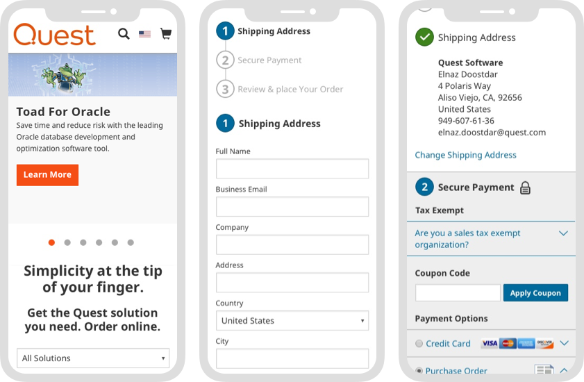
Checkout Step 1

On the checkout page, customers can clearly see how many steps involved in completing their purchase along with a summary of their order. This will create a simplified linear flow. Step 1 will ask for their shipping address.
Checkout Step 2

In the second step, customers will enter their payment information. Based on my literature review adding a padlock icon along with a different background color will improve the security perception of the customers and will help to build trust. I also recommended an interactive plugin for credit card information to avoid errors while inputting the card details.
Checkout Step 3

In this step, customers will review their orders and need to accept the terms and conditions to place their orders. I got rid of the summary box at this stage thinking they have all the information on previous steps present on the page at this point.
User Feedback & Revisions
I created a click base prototype in Frontify to evaluate the flow. During each evaluation session with users, I explained the task scenario and asked them to speak out loud while going through the flow. I also asked them a few follow-up questions and encourage them to provide feedback.
I've also presented the wireframes to developers and walked them through the process to make sure what we design is feasible to implement. They provided great insights that made me rethink some of the functionalities based on platform limitations and effort required for customization.
Based on the feedback I received I created the following design recommendations:


Mockups
I created high-fi mockups using a mini style guide from Quest design library (Sketch symbols) applying the recommendations I captured from our evaluation session. I also took the lead to create a prototype for our next revision using Frontify.
Desktop Mockups


Evaluate
Usability Testing & Design Iteration
Similar to our previous user testing session, I conducted several moderated usability testing sessions with some of our customers. Here are some additional feedback and revisions accordingly:
Product Listing
Before

After

Customers found it hard to change the filters while scrolling down the listing page. I made the filter area fixed position on the page to make it always available to them while scrolling.
Product Detail
Before

After

Customers ignored the information related to quantity limitations or other selling conditions regardless of having them in a separate paragraph. Based on the principle of proximity (Gestalt theory) I put this information right below the items they related to.
Product Detail with Licensing Options
Before
After

Most customers ignored the license guide link to view additional information about licensing options & savings and therefore missed the savings. I created a section on the page to display all the options and put the action button below each option to grab their attention.
Product Detail with Editions
Before

After

Customers tried to add multiple editions to the cart and taking them to cart page after adding the item to the cart made them frustrated. I created a dropdown button instead of a default button with the option of:
- Adding to the cart and go to cart page
Or
- Adding to the cart and continue shopping to avoid this issue
Final Prototype & Mobile Mockups
I have created an interactive prototype with the latest mockups using InVision.Mobile Mockups


Hand Over to Developers
Since I used Sketch to create all the mockups for this project I exported all of them to Zeplin to hand over the CSS specs to developers along with the final prototype.

Impact & Improvements
The redesign of Quest e-commerce website had a positive impact on the checkout experience and content organization in general. It helped:
- Reducing contact sales rate by 11%
- Decreasing cart abandonment rate by 8%
- Improving checkout completion task time
However, the conversion rate has not been significantly increased which means we have more things to do. Here are some ideas for future phase improvement:
- Single sign-on for both marketing and e-commerce site so that customers can have a personalized dashboard
- Personalization based on purchase history
- Notifications for important product updates and new editions
- Continuous survey and evaluation